


🩺 Context
UHCSR revolutionizes college healthcare. Backed by UnitedHealth Group, the largest U.S. health carrier, they offer tailored insurance plans for students.
⚠️ Challenge
The UHCSR Healthcare Insurance App lacks a seamless user experience, hindering students' ability to efficiently navigate and access essential information.
🎯 Objective
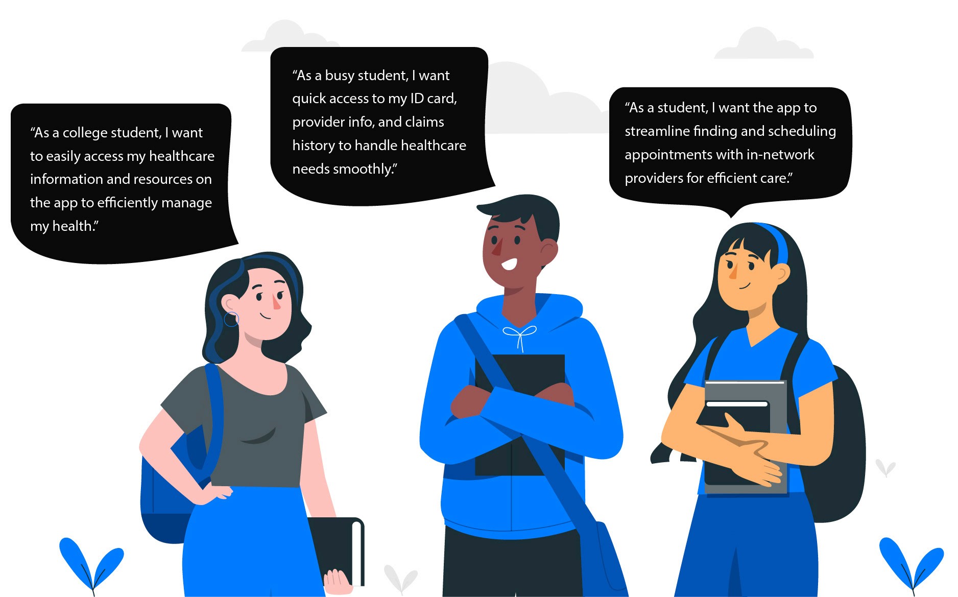
Research, strategize, and design an end-to-end app experience to facilitate seamless access to healthcare resources for students. The primary focus is to increase user engagement metrics, such as daily active users, app retention rates, and task completion rates, by 30% compared to the previous MVP.
Results
30%
25%


Should appointment scheduling be tied to favorites?
Students wanted continuity and control — but would linking scheduling to favorite providers streamline their experience or introduce unnecessary complexity?

Yes — students wanted easy access to trusted providers, so scheduling was integrated with Favorites

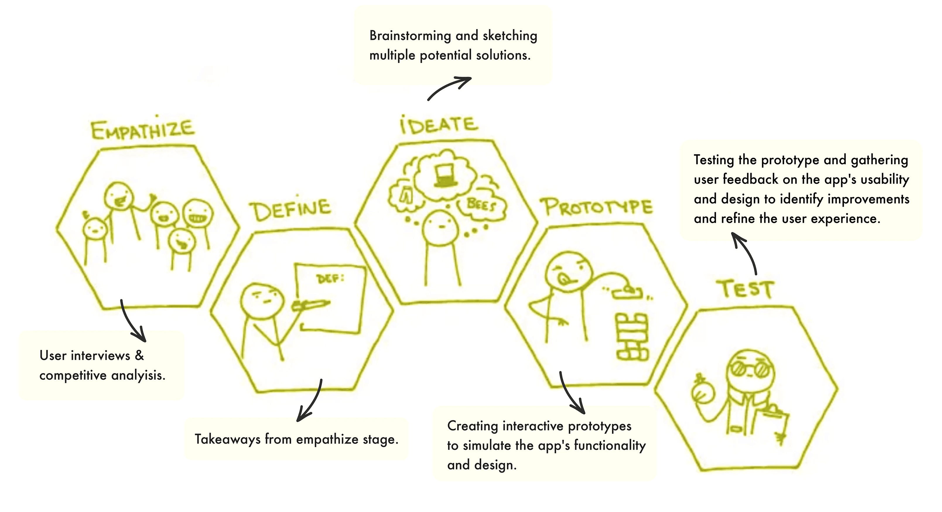
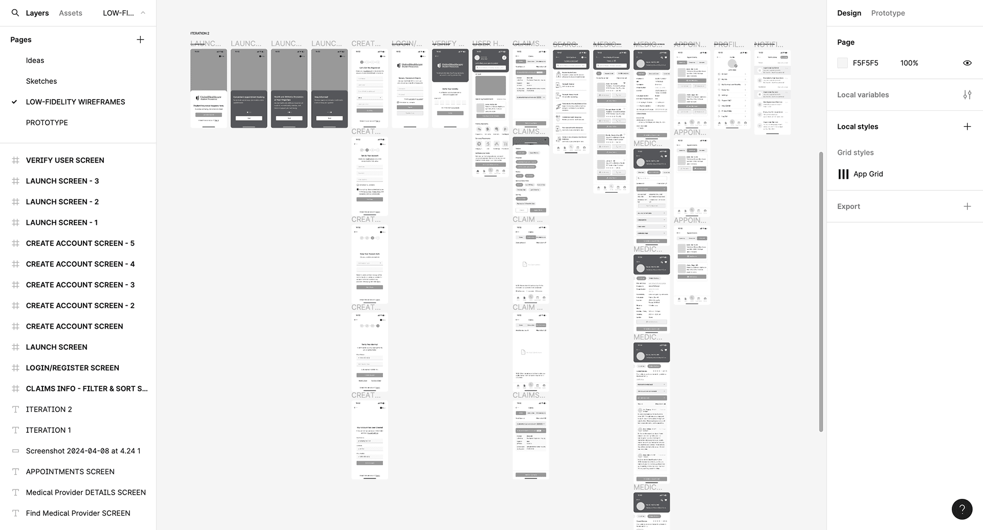
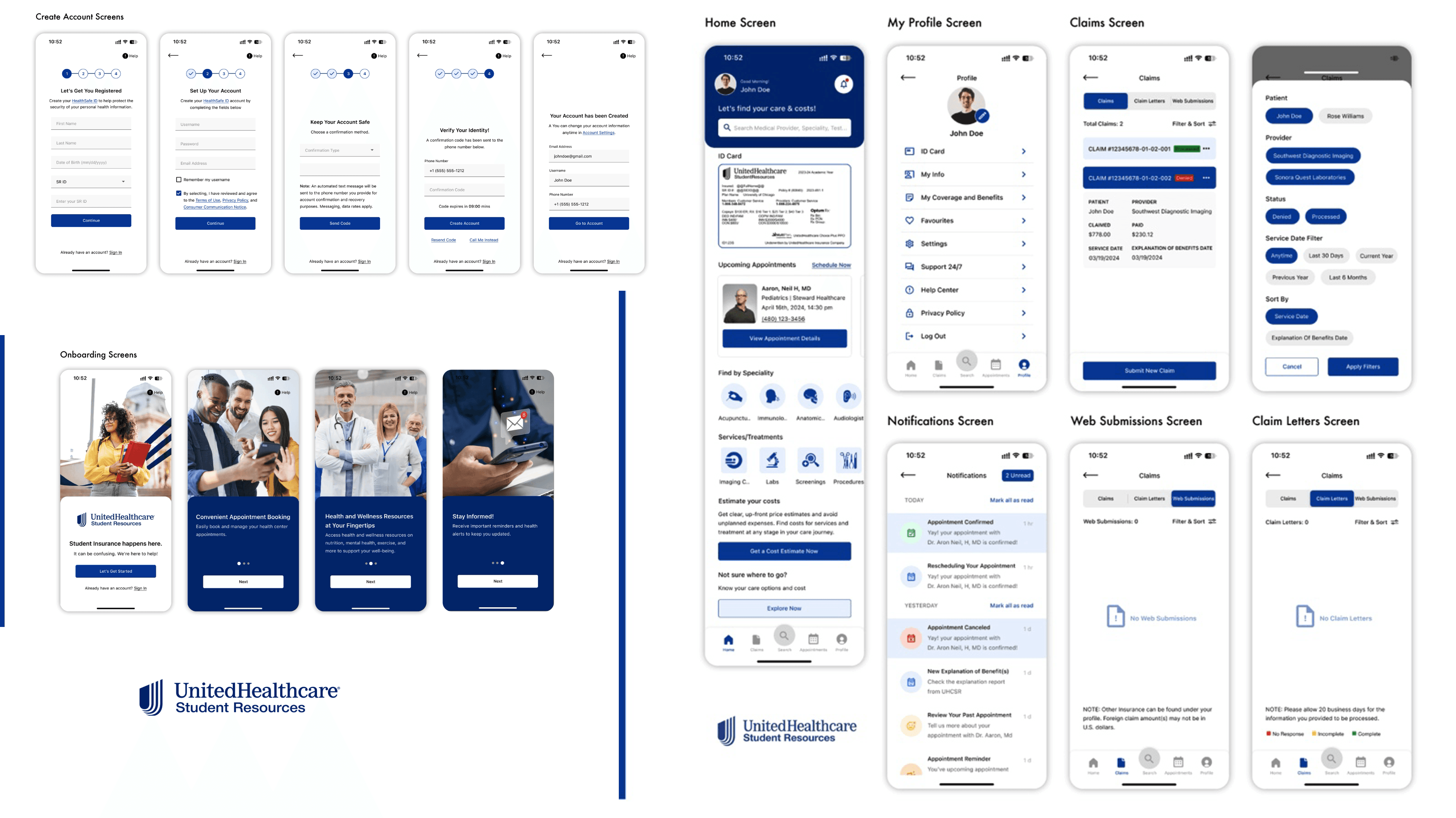
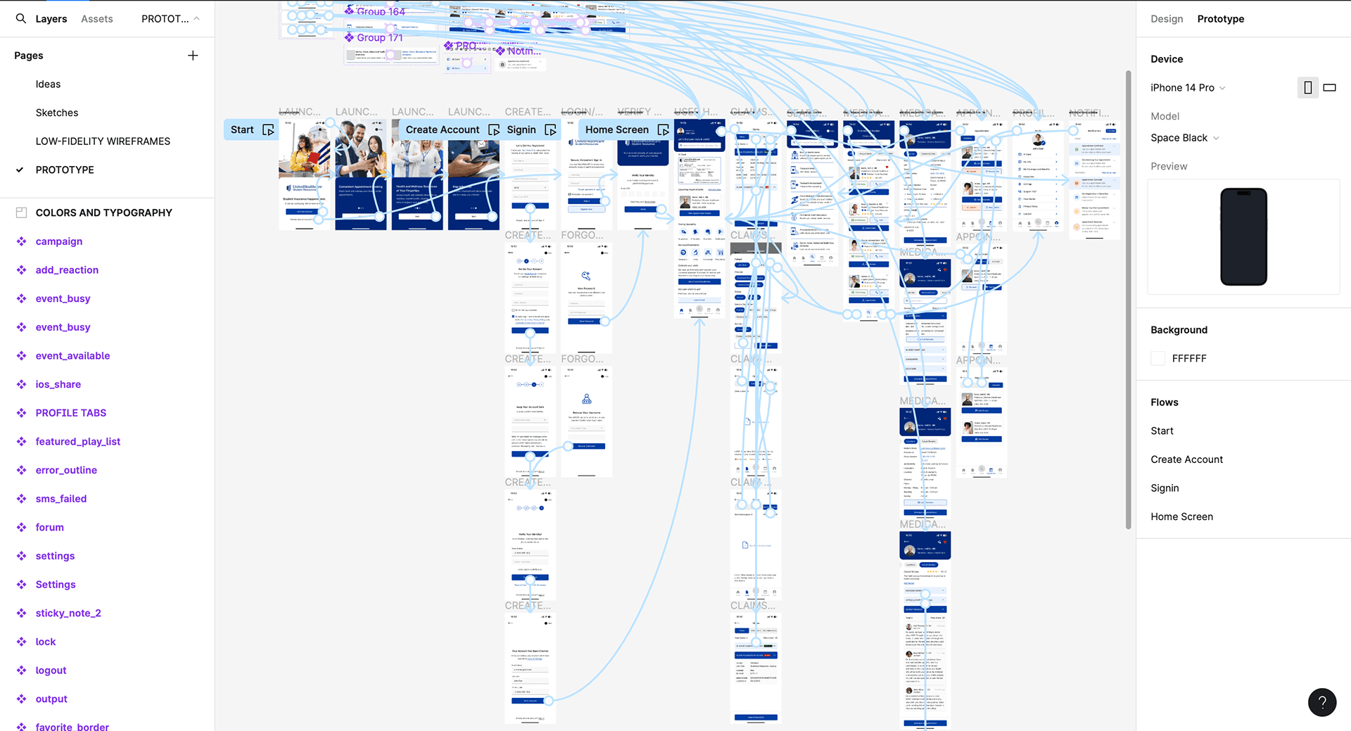
Started with low-fidelity wireframes to map core flows and layout ideas, then evolved them into high-fidelity designs focused on usability and visual clarity.
Low-fidelity Wireframes
High-fidelity Wireframes
The high-fidelity designs bring research insights to life by solving the most critical pain points students faced in the existing app. Below are the key features introduced to improve clarity, control, and confidence in navigating their healthcare.
Feature Highlights
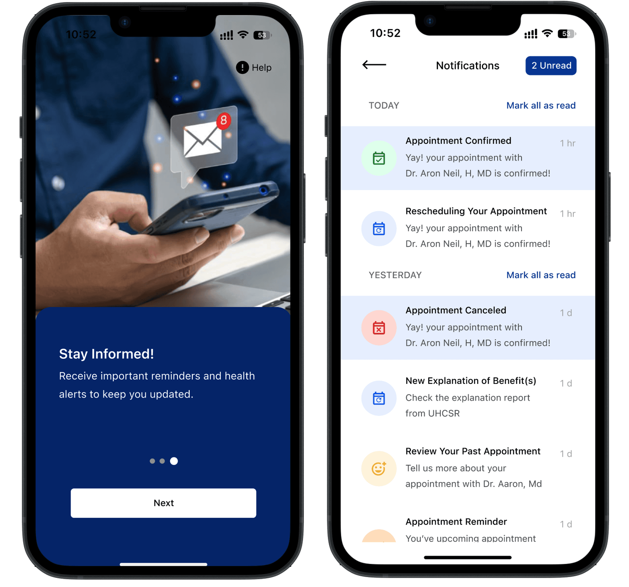
Push Notifications
Keep students informed without overwhelming them
Smart, timely alerts for claims, provider updates, and key account activity.
Original Design

Refined Design
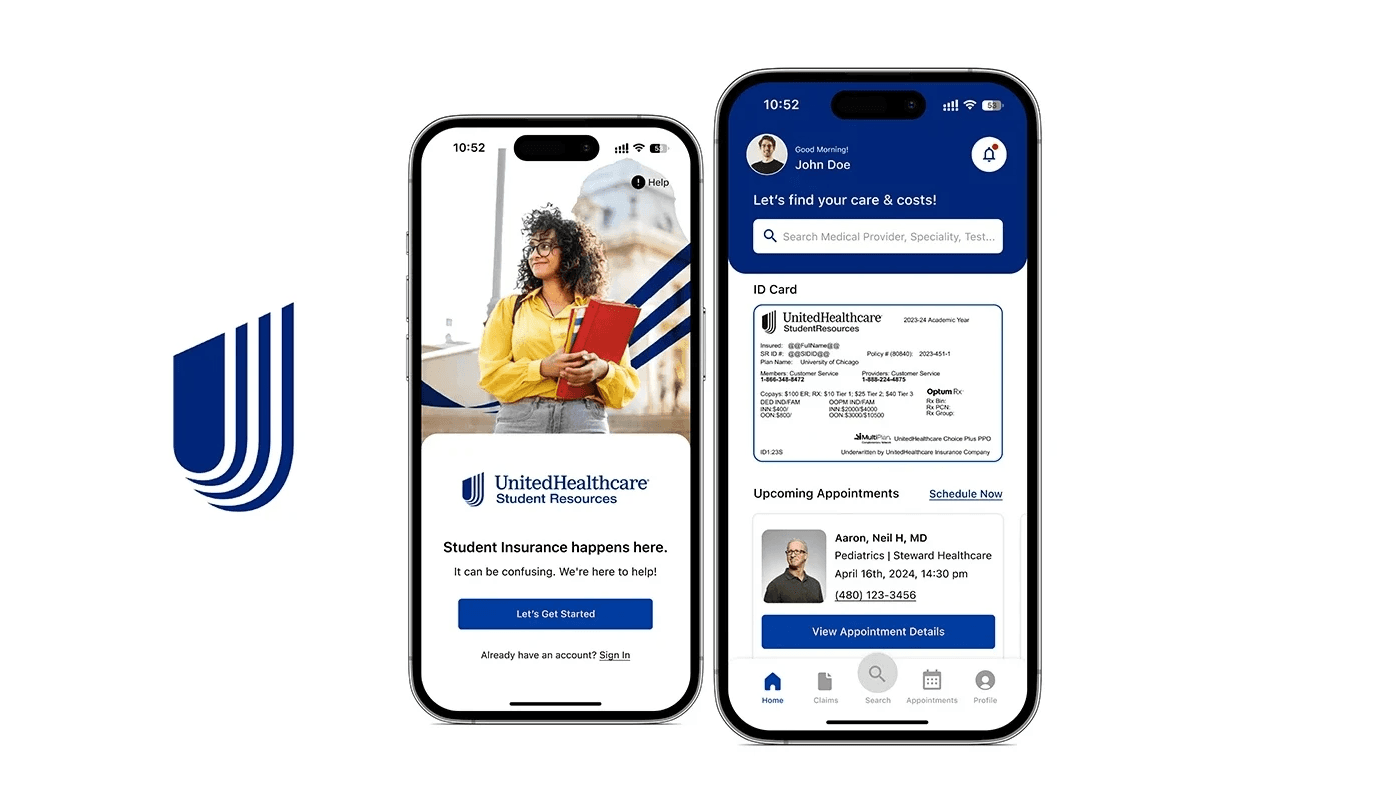
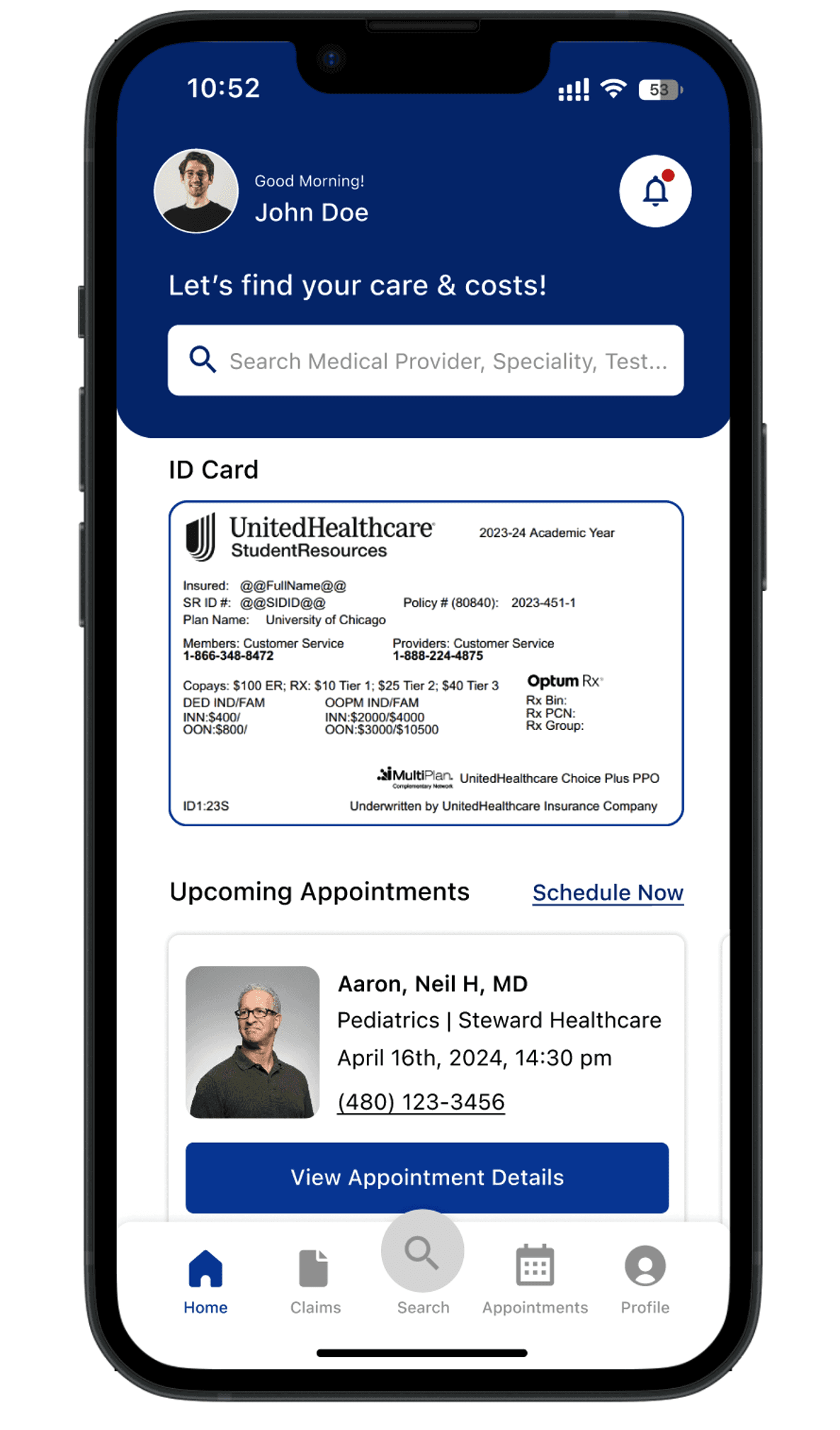
Instant Access to Key Information
Get what you need, fast
Students can now view their insurance ID and plan details from the home screen.
Original Design
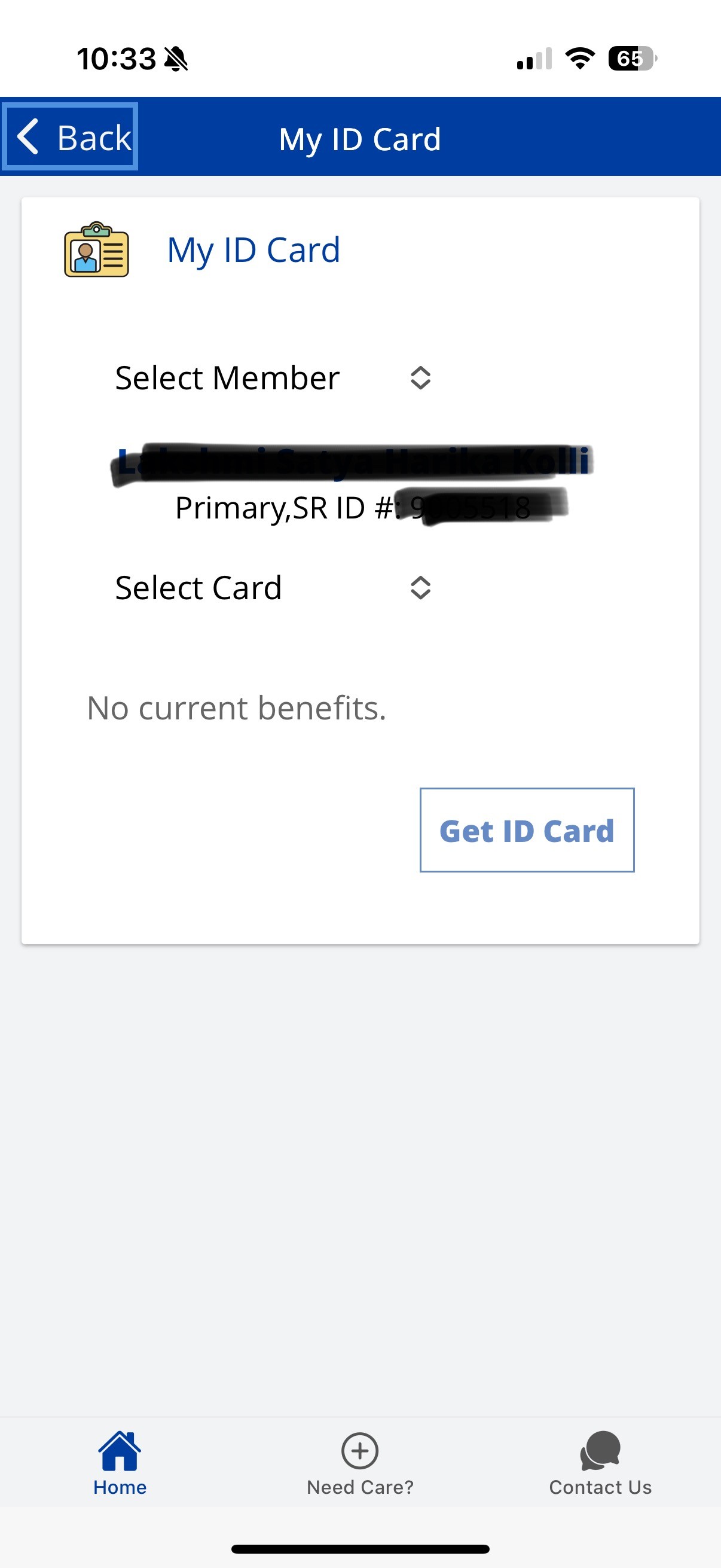
Refined Design
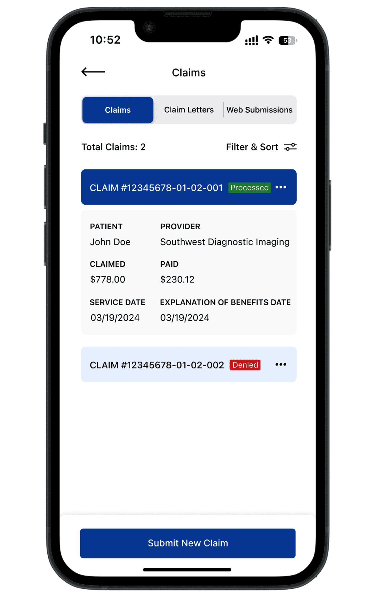
Claim Status Tracker
Know where things stand
A simplified claim tracker with status indicators reduces confusion and support requests.
Original Design
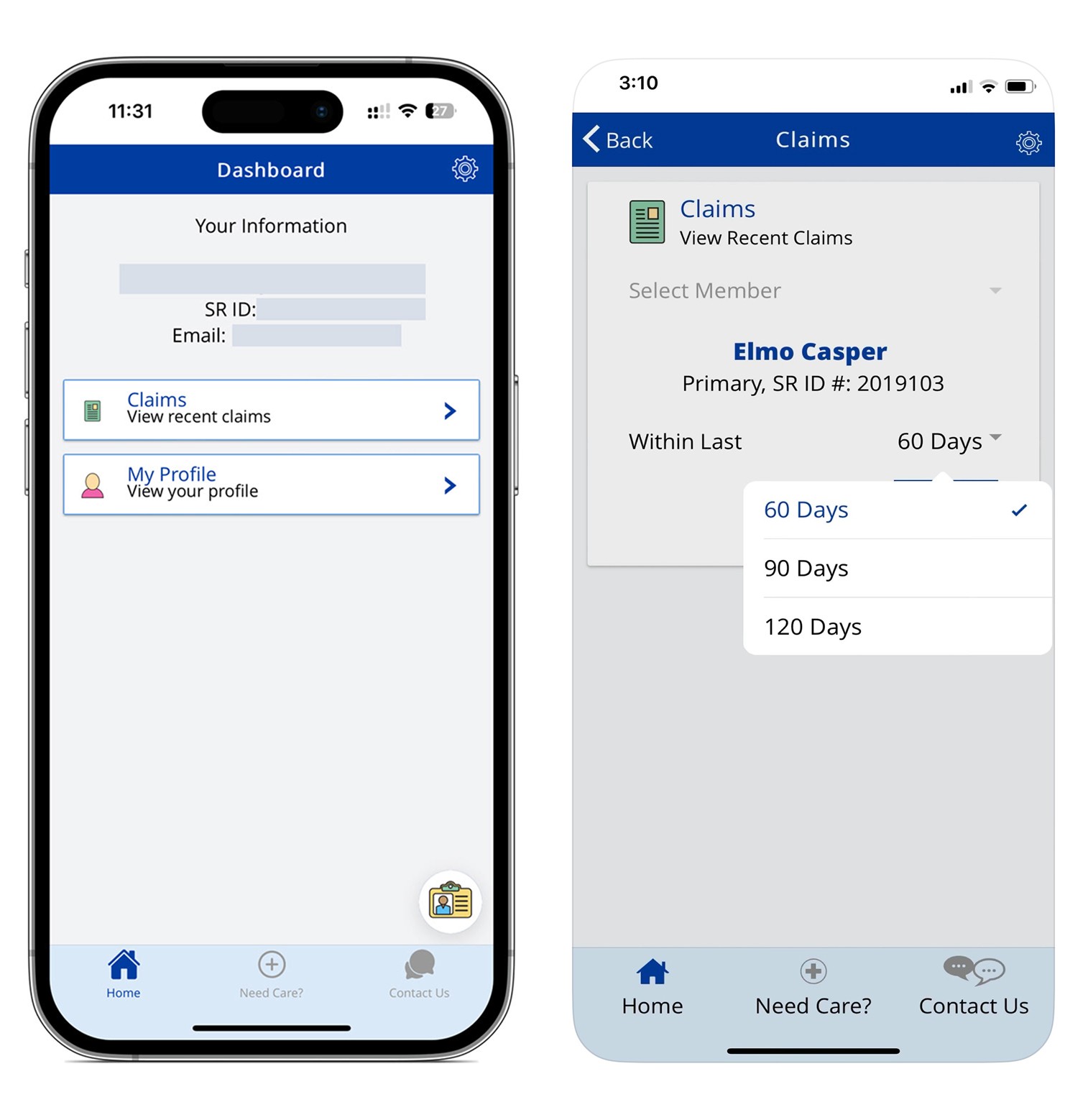
Refined Design
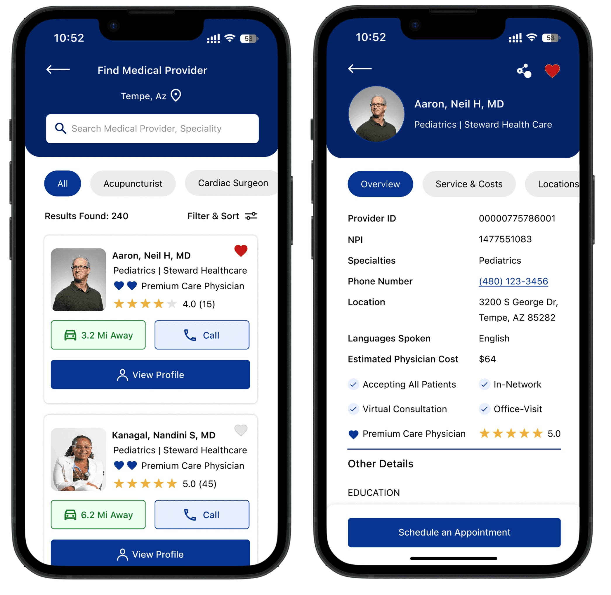
Favorites + Scheduling
Personalized provider experience
Students can bookmark providers and get notified when appointments become available.
Original Design

Refined Design
A complete view of the redesigned experience—from onboarding to scheduling.
Method of Evaluation
Where
30+
5
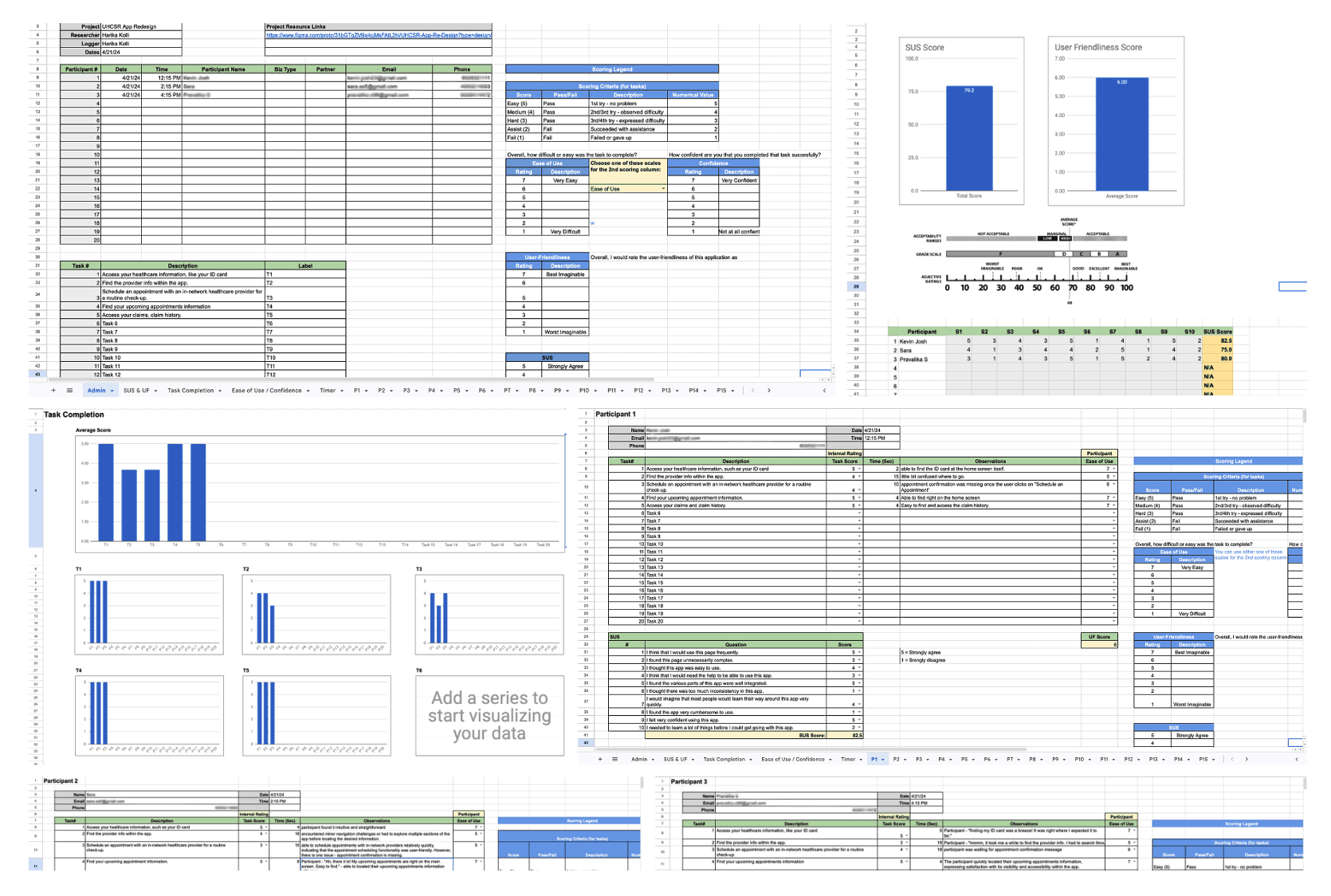
79.2
30%
Tasks for the Participants
1. Access your healthcare information, such as your ID card
2. Find the provider info within the app.
3. Schedule an appointment with an in-network healthcare provider for a routine check-up.
4. Find your upcoming appointment information.
5. Access your claims and claim history.
Screenshots from test sessions
Observations
1. Participants found it intuitive and straightforward to find their ID card information.
2. Participants encountered minor navigation challenges or had to explore a couple of sections of the app before locating the provider information.
3. Participants were able to quickly locate the upcoming appointment information.
4. Participants had a positive experience accessing their claims history.
Results
30%
25%
Recommendations
1. Enhance provider information visibility: Increase the visibility of provider information by implementing a dedicated section for provider details to ensure that users can easily find and access this essential information.
2. Streamline appointment scheduling: Simplify the appointment scheduling process by providing clearer instructions and guidance. To improve usability by incorporating features such as calendar integration and real-time availability updates.
Analyze Test Results
Review usability testing feedback to extract actionable insights and identify areas for improvement.Iterate the Design
Refine wireframes based on test findings to ensure stronger alignment with user needs and expectations.Prototype Refinement
Update the interactive prototype to reflect design improvements and enhance overall usability.Optional Additional Testing
Conduct follow-up testing, if needed, to validate refinements and ensure the solution remains user-centered.Finalize Design for Handoff
Prepare detailed design specifications and documentation for a smooth handoff to development.